Apple's New Interface for Macs and iPhones Resembles Windows Vista
Apple's latest user interface emphasizes transparency and fluidity, but echoes design elements seen in Windows Vista.
When you design software, especially in the tech realm, it’s easy to reshuffle familiar concepts and present them as revolutionary. Apple’s newly unveiled design aesthetic for iOS 26 and MacOS 26, branded as “Liquid Glass,” is precisely that. This UI promises to blend the aesthetic qualities of glass with a fluidity, yet it unmistakably resembles the transparent effects first popularized by Windows Vista nearly two decades ago.
The feature list touted by Apple includes “a completely transparent menu bar that enhances the display’s spaciousness” and rounded control menus which supposedly enhance harmony between the hardware, software, and content. However, seasoned tech enthusiasts will recognize these details as a significant return to trends seen during the Vista era, noted for its sleek and modern translucent look.
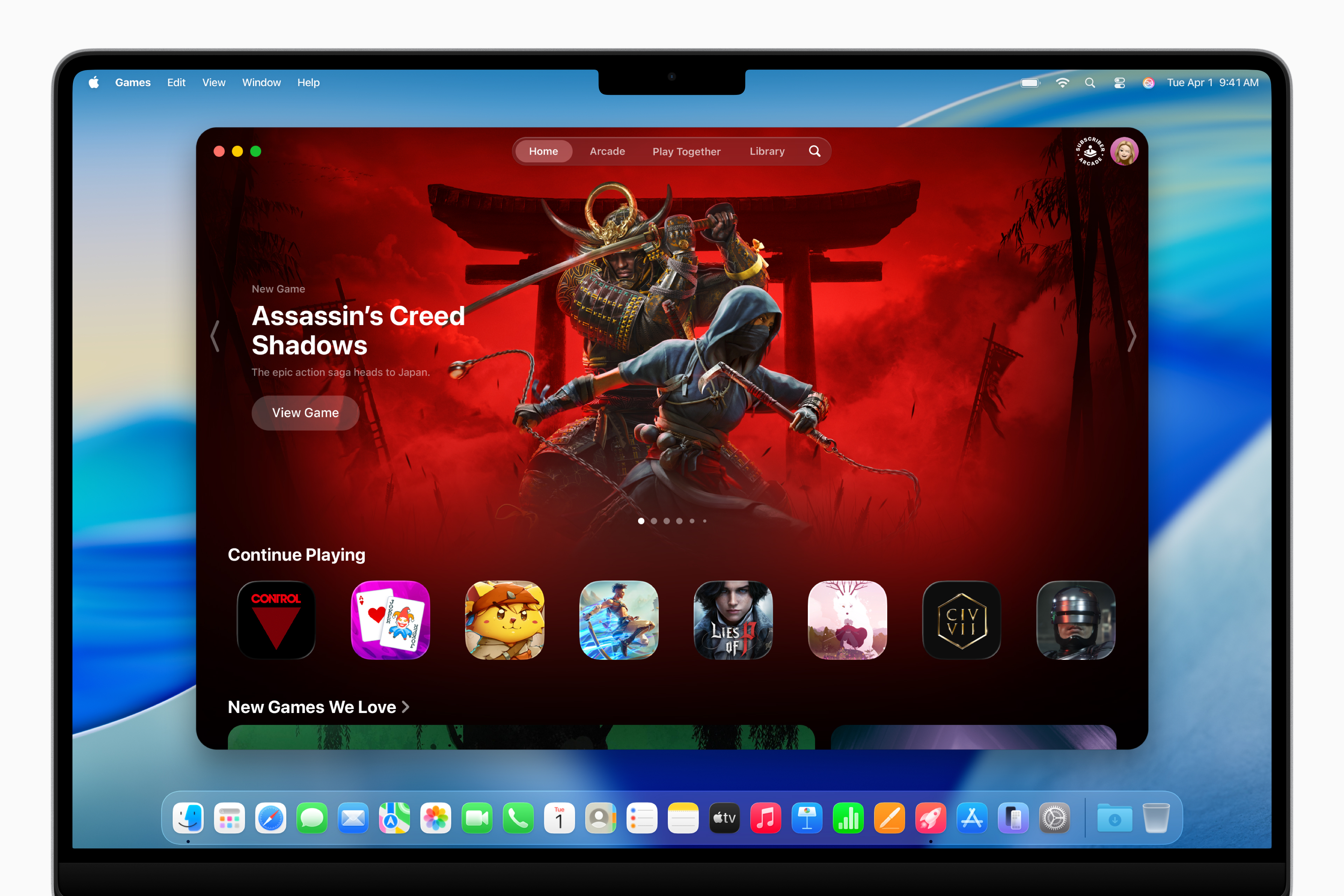
Apple’s UI
( Image credit: Apple )
While this UI is currently available only in a developer beta, it heavily borrows from design elements that characterized prior operating systems. Windows Vista laid a fertile groundwork for such aesthetics, and while Apple may dream up great names like Liquid Glass, the reality is that the concept has already traveled through the industry’s formative years.
Tech innovations are cyclical; design trends re-emerge within a decade, leading to a revival of styles once considered outdated. You could see it now with ‘roundness’ being in vogue, but as various elements evolve, rectangles may make a grand return before we know it.
In conclusion, Apple’s elegant execution of frosted glass aesthetics may look delightful, but it beckons the nostalgic days of Windows Vista and raises questions about true originality in tech design. Who would have anticipated that the past would manifest so distinctly in a company that prides itself on innovation?