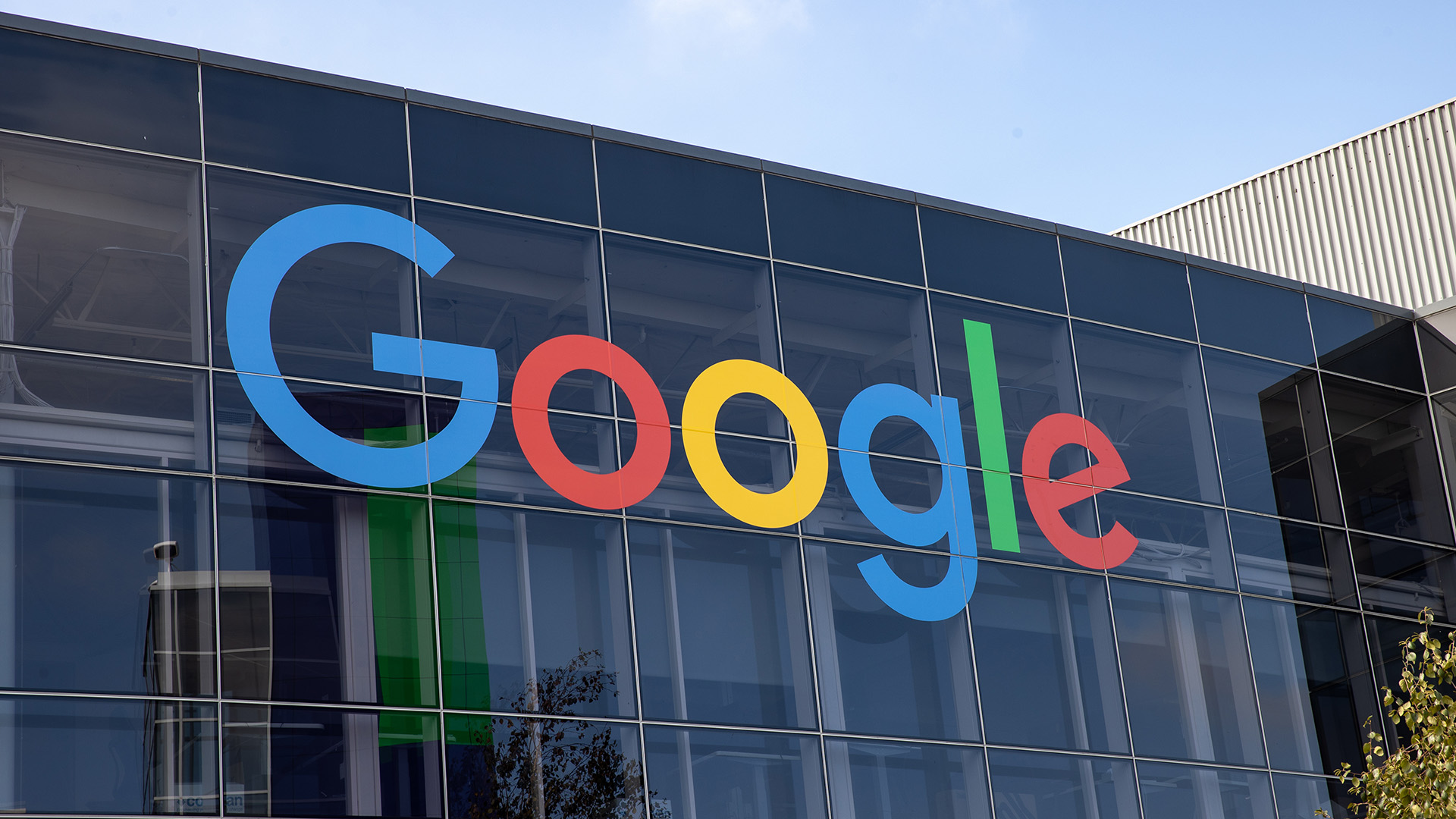
Google has unveiled a new logo, marking its first major change in the last decade. This update not only refreshes its visual identity but also raises questions about the associated costs with such branding changes. The minimalist approach taken by Google appears to be a simple yet significant evolution in its design strategy.
 Google’s Updated Logo
Significant Redesign
Brand redesigns can carry heavy financial implications, especially for a corporation as large as Google. According to reports, such changes might incur costs in the millions, prompting speculation around how much Google’s redesign actually costs.
A Minimalist Approach
The updated logo features subtle modifications that are described as a simplistic Gaussian blur effect. Initial impressions reflect contemplation within marketing and branding circles about where this trend might lead in the years to come.
“This might be the most expensive Gaussian blur in history.”
Looking back, major corporations have had similar experiences; the BBC spent £7 million on a rebranding effort, while British Petroleum faced backlash for a logo change costing £4.6 million. Such historical parallels illuminate the substantial efforts and resources devoted to maintaining a modern image that resonates with consumers.
Future Implications
This shift signifies much more than a visual tweak, as it sets a precedent within the tech industry, influencing trends in design and branding strategies that could disrupt traditional approaches. The balancing act continues as companies strive to innovate while managing the costs that come with reinventing their public persona.
